Make a design ...
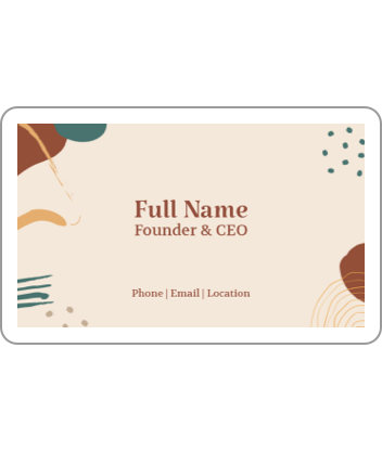

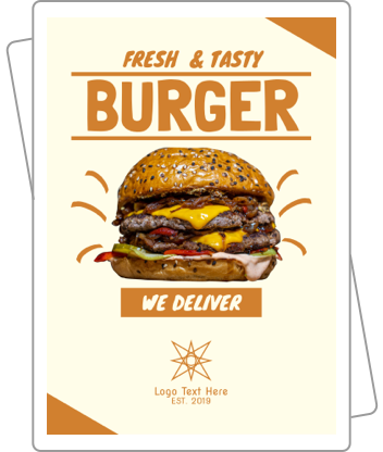
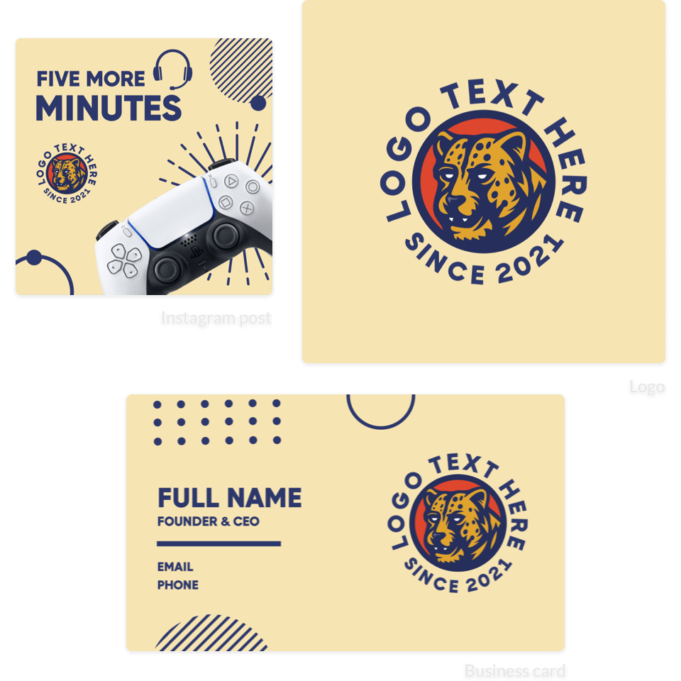
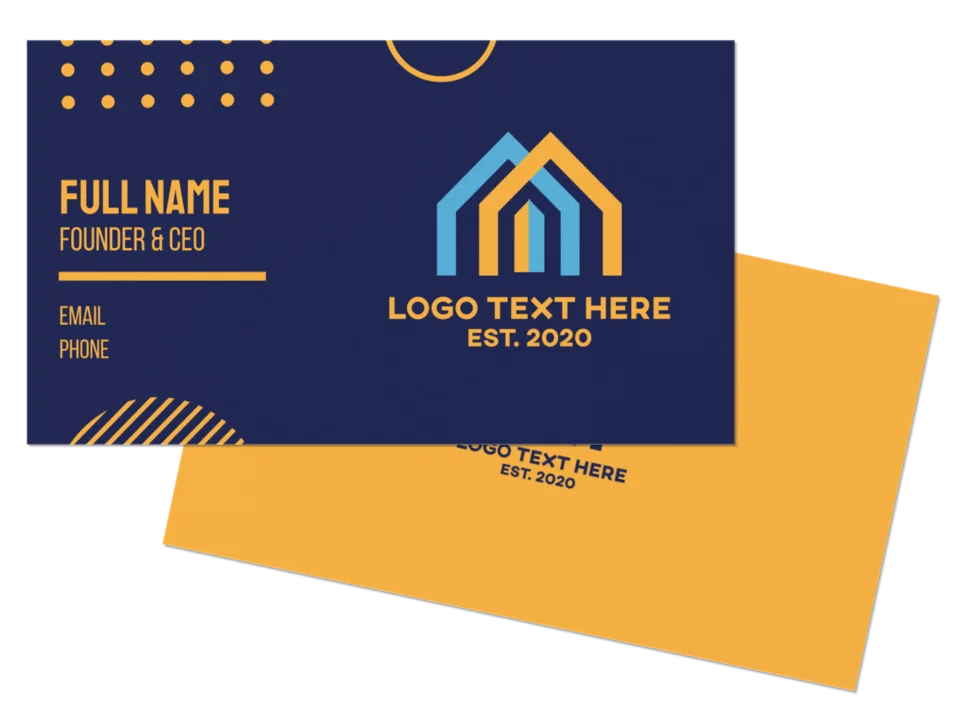
Business Card Maker
Create a stunning business card in minutes. Browse thousands of professionally curated business cards and edit them with ease. Whether you're an accountant or hairstylist, we've got a business card that's perfect for you. Our business card maker lets you edit the colors, font, and layout, then download the card instantly.
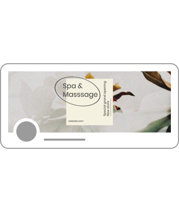
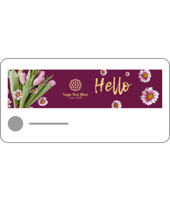
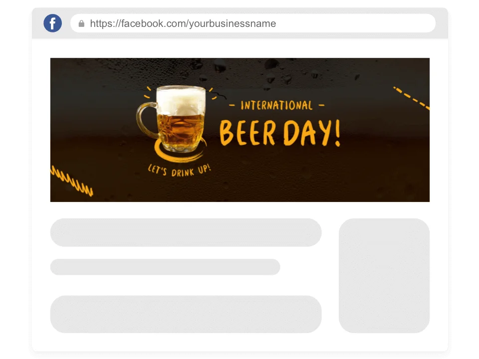
Facebook Cover Maker
Your Facebook cover is the face of your business. Make your Facebook covers stand out by creating a unique design with our Facebook cover maker. With thousands of templates to choose from, it's never been easier to produce a Facebook cover you'll love. Edit the images, layout, fonts, and colors—then share it with the world.
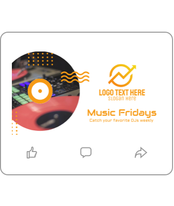
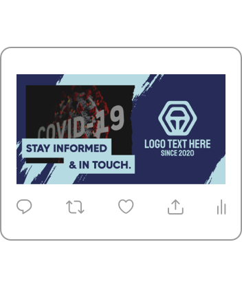
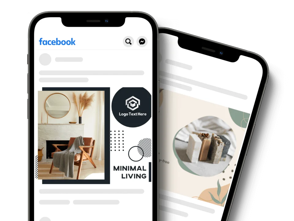
Facebook Post Maker
Start your journey towards social media relevance with captivating Facebook posts. Our easy-to-use Facebook post maker gives you the creative freedom to apply the fonts, colors and shapes you like. No matter what industry you're in, you'll make graphics that will make your followers stop scrolling and read what you've got to say.
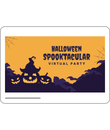
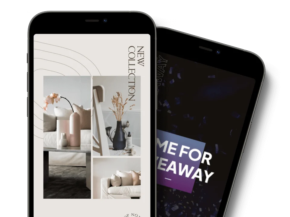
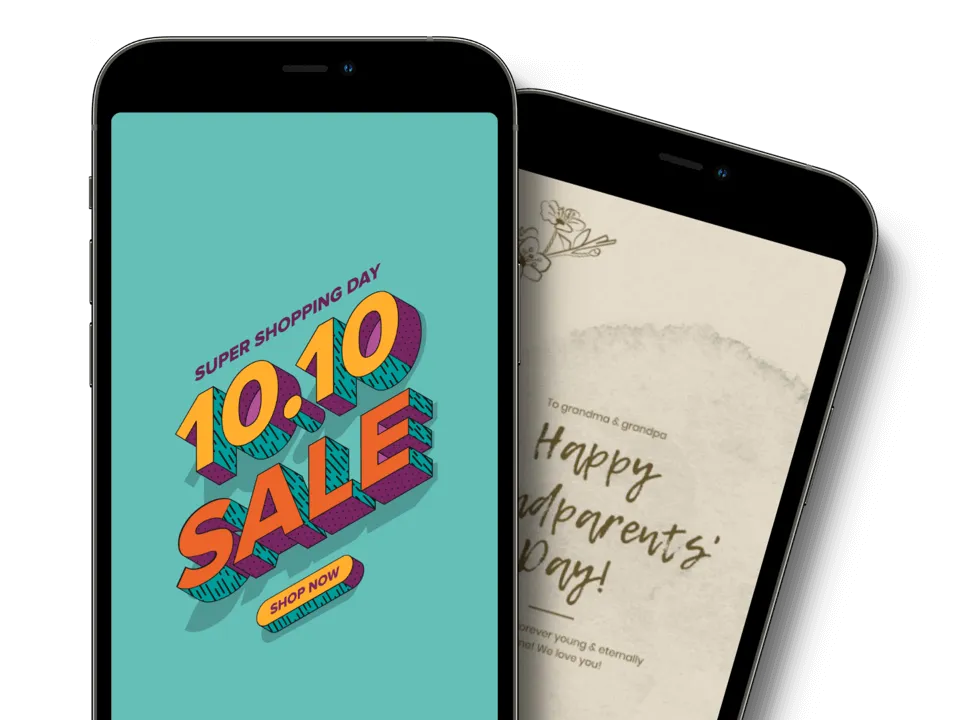
Facebook Story Maker
Engage followers with impressive Facebook stories. Inform your audience what makes you different in a visually striking way using our Facebook story maker. It lets you create your medley of colors, shapes and fonts to create a great design. Become more visible to the 500 million consumers using stories today.
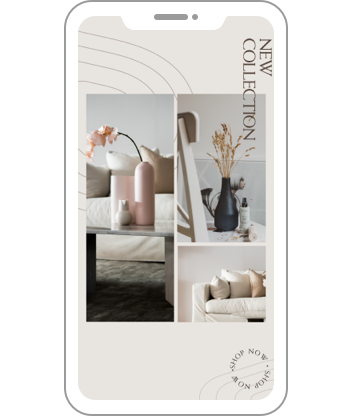
Instagram Story Maker
Make every second count with impressive Instagram stories. You'll reel in your viewers using our Instagram story maker. Use the maker to incorporate fonts, colors and shapes that will make your business distinct. In minutes, you can create a design that will reinforce your brand identity to the fullest.
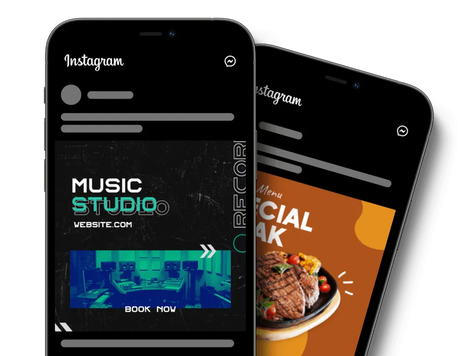
Instagram Post Maker
Visuals are everything on Instagram. Look your best in all your Instagrams posts by creating your graphics on our Instagram post maker. It's a tool that you can use to up the quality and consistency of each image. Come up with your own design using various colors, fonts and layouts. Take control over your IG posts today.
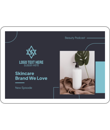
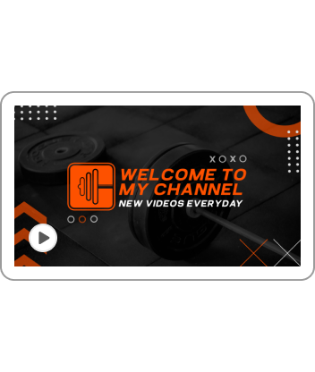
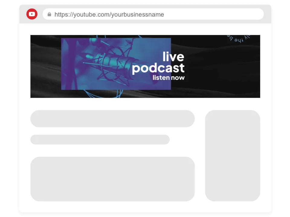
YouTube Banner Maker
Tie your whole channel together using a beautiful YouTube banner. You will get everything you need to express yourself using design elements like fonts, colors and layout. Get a head start by browsing through a curated library of designs that fit every niches. Impress your viewers the first time they see your channel.
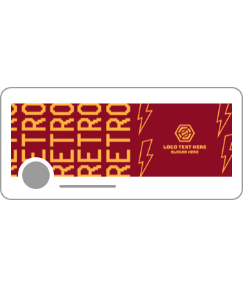
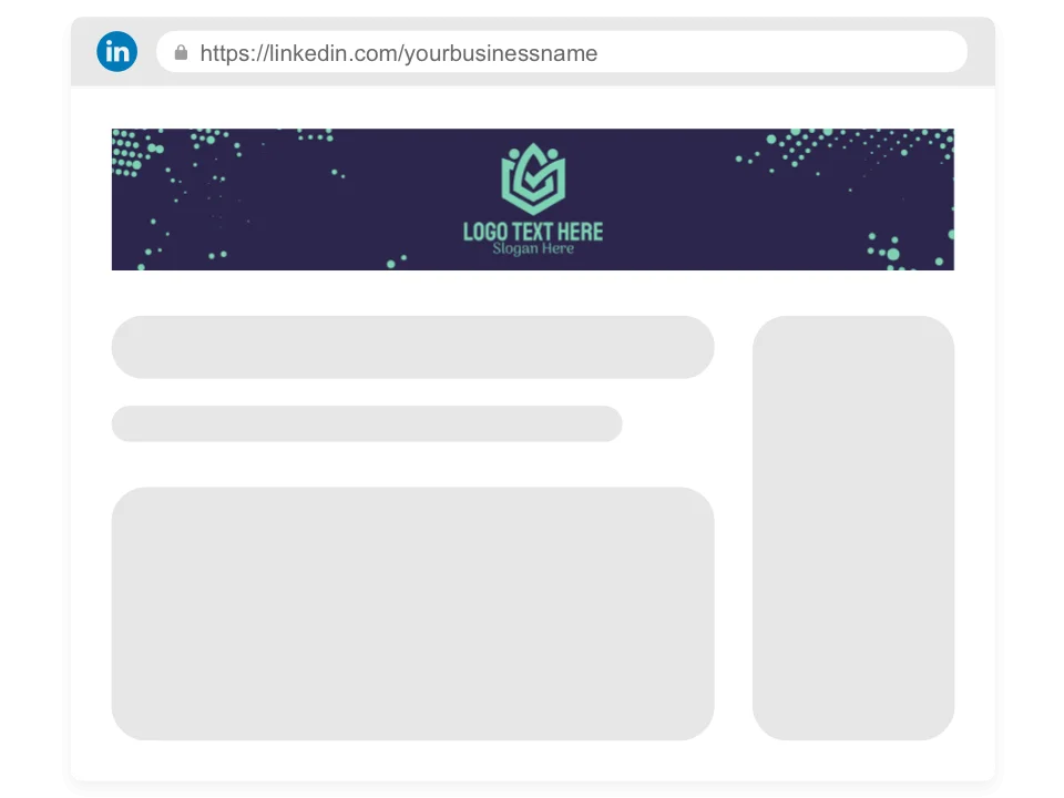
LinkedIn Banner Maker
Be an authoritative voice in your industry with an outstanding LinkedIn banner. Give our LinkedIn banner maker a spin and craft a design that will make your profile stand out. Find the best designs for B2Bs, B2Cs, and more. Customize professionally curated designs and apply your brand colors, fonts and layout to achieve a consistent look.
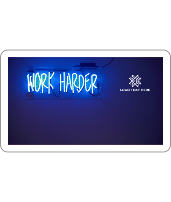
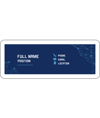
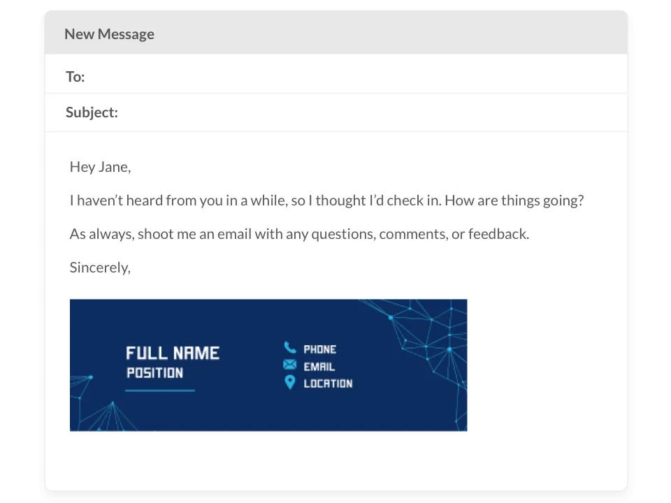
Email Signature Maker
Build trust from the first email with a standout email signature. The right design helps you connect with your target audience and drive more traffic to your website. Our maker and design library are all you need to create your ideal signoff. Personalize by changing design elements without breaking a sweat. Get the ideal design in minutes.
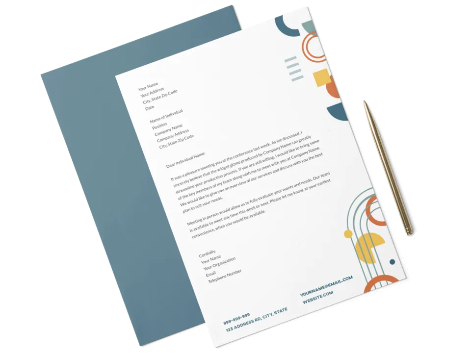
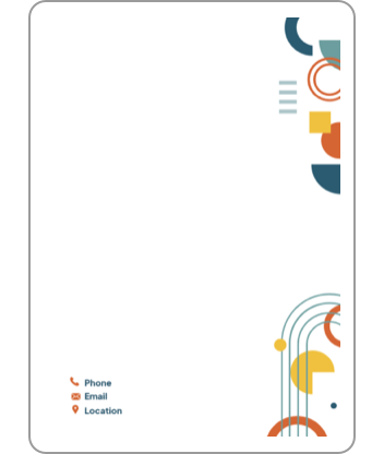
Letterhead Maker
Ensure consistency in all brand collateral by creating a stunning letterhead. The library gives you access to professional designs that will fit any brand, from tech to fashion. Get a recognizable letterhead design by incorporating your brand identity through font, colors and other elements. Become more credible with a letterhead from us.